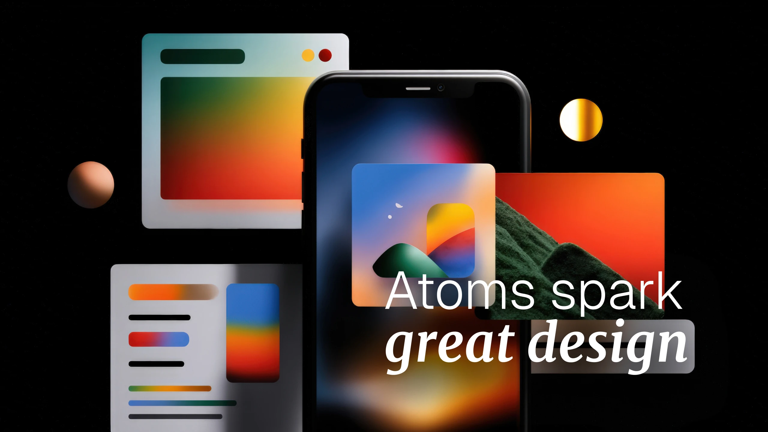
The Atomic Series: The secret sauce to great UI

Fred Voigtländer
UI Designer
calender-image
July 25, 2025
clock-image
5 mins read

To me, great UI design isn’t just about making things look nice on the surface. It’s about weaving together a bunch of small, thoughtful pieces that, when combined just right, make the entire experience feel intuitive, seamless, and even delightful. I like to think of these pieces as atoms – individually simple, but powerful when brought together in the right way.

In this series, I’m going to dive into those essential atoms: core elements like colour, typography, hierarchy, and spacing. Each one might seem subtle on its own, but together, they shape how users feel, move, and interact with an interface. These aren't just aesthetic choices. They’re foundational building blocks that influence clarity, usability, and the overall vibe of a product.

I’ll also explore how structure comes into play, things like grids that create rhythm and order, buttons that feel satisfying to click, and visual touches like icons and illustrations that communicate without needing words. Then there’s feedback, the kind that quietly reassures users and helps them understand what’s happening, without adding friction or confusion.

Every atom brings its own energy to the table. Over the next few posts, I’ll break down what gives each one its strength, how they interact with each other, and how you can use them intentionally to design UIs that not only function well but truly resonate with people.

Share on: