About the project
FreeFlow is more than just transportation from point A to B—it’s about delivering a seamless mobility experience centered around the needs of city dwellers. Whether you're cycling through urban streets, carpooling to cut down emissions, or using public transport, FreeFlow brings everything together into one connected journey.
FreeFlow will become a catalyst for change, helping cities shift citizen behavior through creative pilot programs that will build trust and inspire a significant move away from private car reliance. By removing friction, FreeFlow will empower users to move through their cities with ease and confidence.

Mission
FreeFlow aims to redefine urban mobility by putting the city user at the center of a seamless, connected transport experience. Therefore, the branding had to involve articulating a clear purpose and mission around smart, sustainable movement; establishing a user-focused identity that resonates with eco-conscious, convenience-driven urban dwellers. FreeFlow has developed a distinctive brand voice that is modern, inclusive, and empowering.
Key areas included creating a compelling visual identity, a tone of voice that emphasises connection and simplicity, and highlights FreeFlow’s integrative role across bikes, carpools, and public transport. The brand positions itself as a mobility connector, not just a service.


Solution
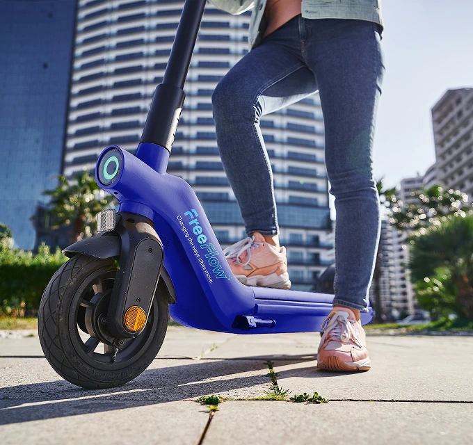
FreeFlow’s branding fuses futuristic minimalism with vibrant urban energy to create a bold, user-first identity for eco-conscious city commuters. A modular wordmark suggests movement and adaptability, supported by a dynamic palette of mint green, skyline blue, and coral—balancing sustainability with innovation.
Transit-inspired typography and human-centered imagery reinforce clarity and inclusivity across all touchpoints, from billboards to apps. Gradients, data visualisations, and topographic overlays — seen in dashboards and illustrations — emphasise seamless tech integration.

The result is a cohesive visual system that moves with the city—smart, inclusive, and always in motion.


