Overview
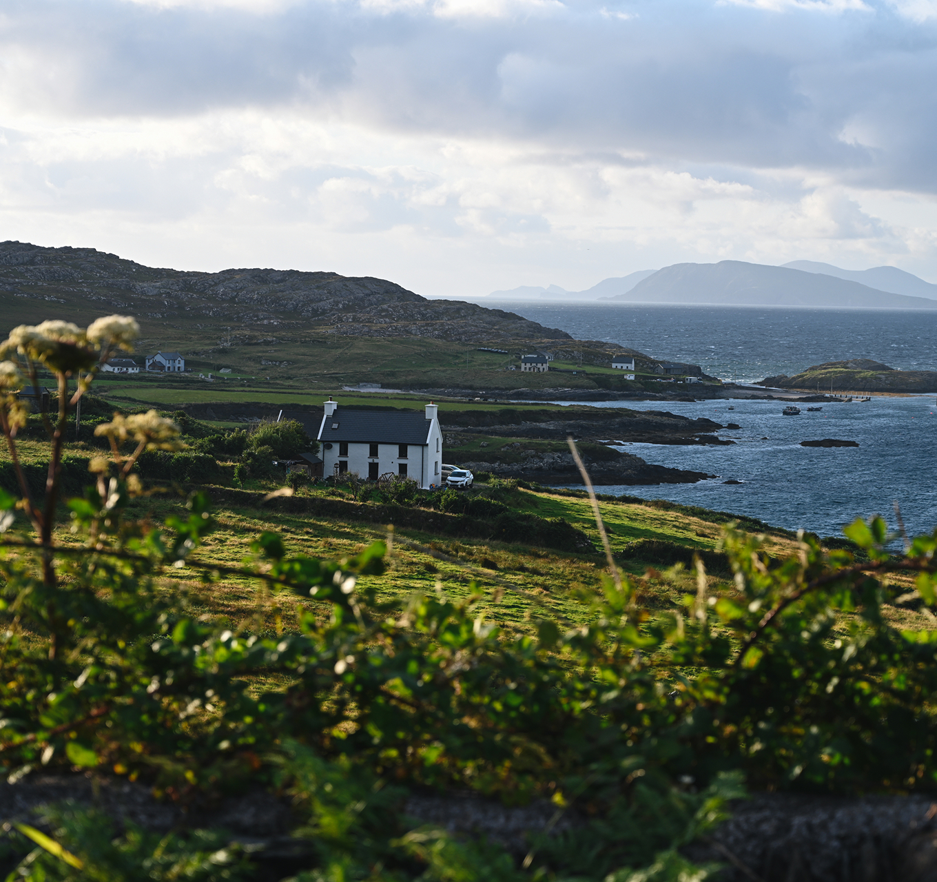
Lidl-breaks.ie, Lidl Ireland's online platform offering discounted hotel deals across Ireland, aimed to modernise how customers discover and book their perfect getaway by creating a refreshed online identity that's welcoming, intuitive, and inspiring.
The vision was to design a platform that reflects the brand’s personality while enhancing every step of the journey from browsing to booking – offering smarter search, personalised recommendations, and fast, mobile-friendly tools, all built to grow with customer needs.
My responsibilities during the project
- Brand designer responsible for a refreshed, digital-ready logo identity for the brand
- Partnered with UX Lead on information architecture and wireframing
- Led the design system setup and UI design
- Handoff to developers and quality assurance to ensure design accuracy
🏔️ The challenge
- Brand inconsistency: Outdated logo below modern brand standards
- Design limitations: Outdated website design not aligned with digital best practices
- Usability issues: Limited mobile functionality hindered discovery, booking, and engagement
💡 The solution
- Logo refresh: Refreshed logo aligned with Lidl's core brand identity
- Mobile-first redesign: Redesigned mobile-first, user-friendly website
- Navigation enhancement: Improved navigation and smarter search for easier bookings
📈 The impact
- Visitor growth: Significant increase in daily visitors
- Page view growth: Strong growth in monthly page views
- Ranking improvement: Major improvement in global ranking
- Performance boost: Faster and smoother page load times
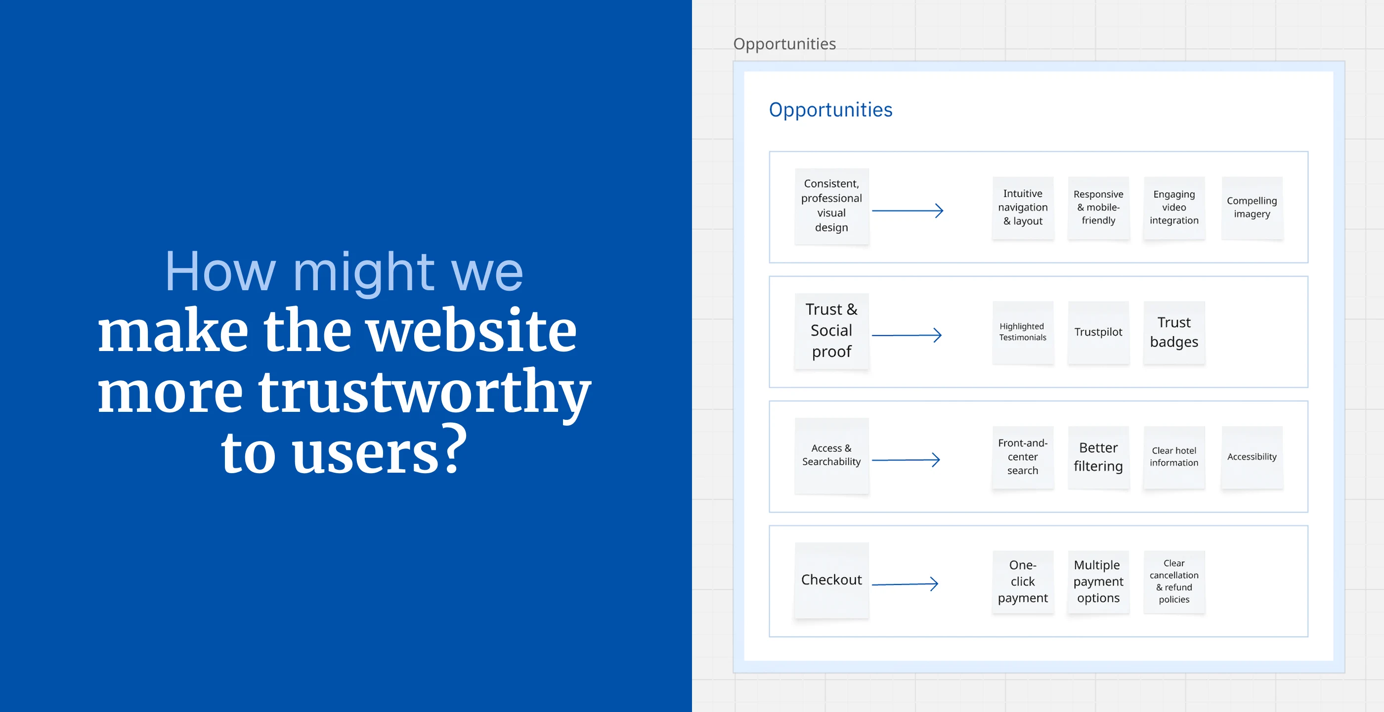
Understanding users and opportunities
The initial discovery phase established a comprehensive understanding of Lidl Breaks' digital landscape through stakeholder collaboration and user research methodologies. This foundational workshop, led by our UX Lead with support from my end, set the strategic direction for the entire redesign project.
Key activities included:
- User pain points & goals: Identified booking complexity and unclear pricing; established goals for budget deals and transparent comparisons
- Persona development: Defined three key user groups - budget families, spontaneous travellers, and methodical planners
- Competitive analysis: Analysed gaps against SuperValu Getaways, booking.com, and last-minute.com
- Card sorting & sitemap: Conducted content categorisation leading to user-centric navigation and streamlined booking journey


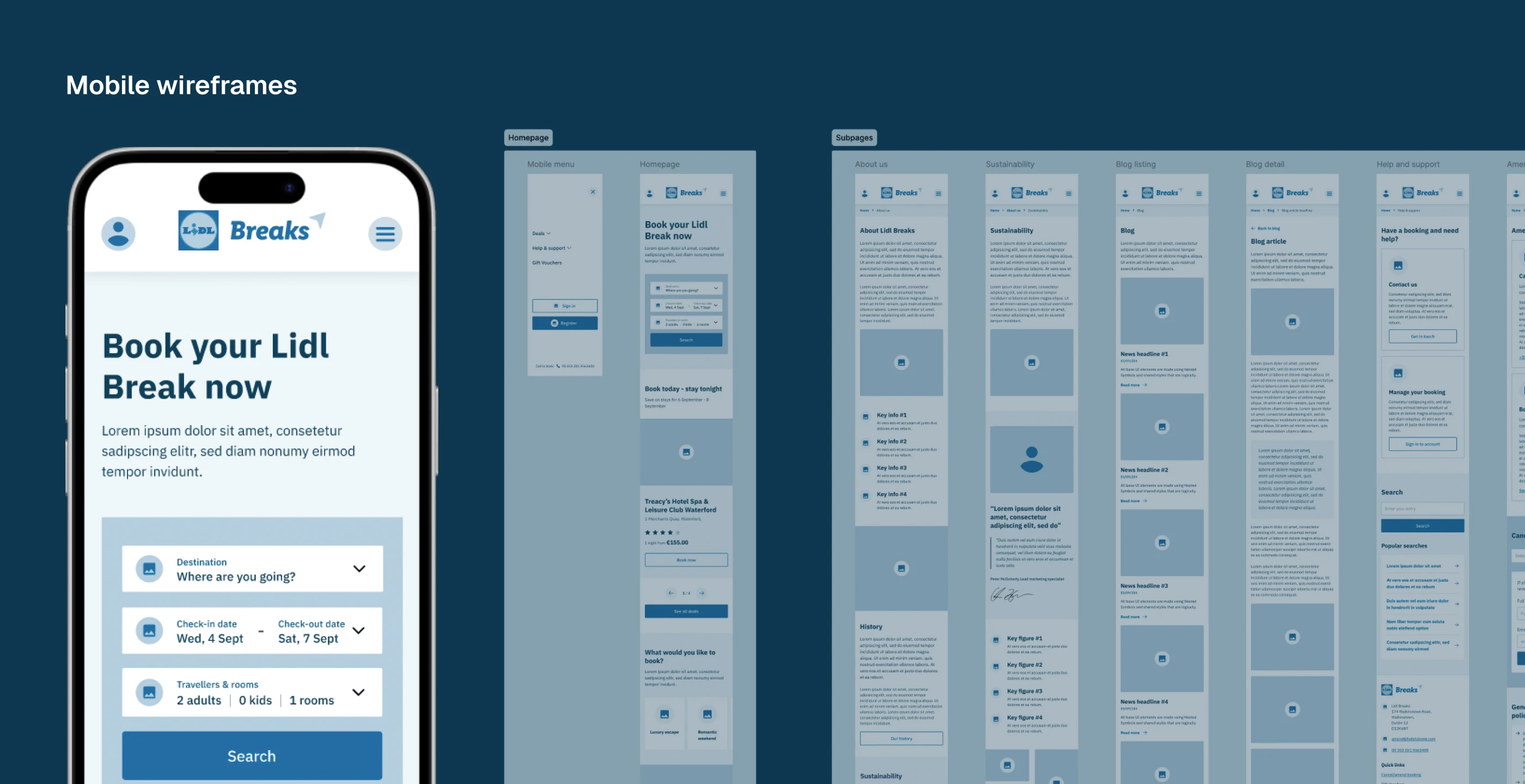
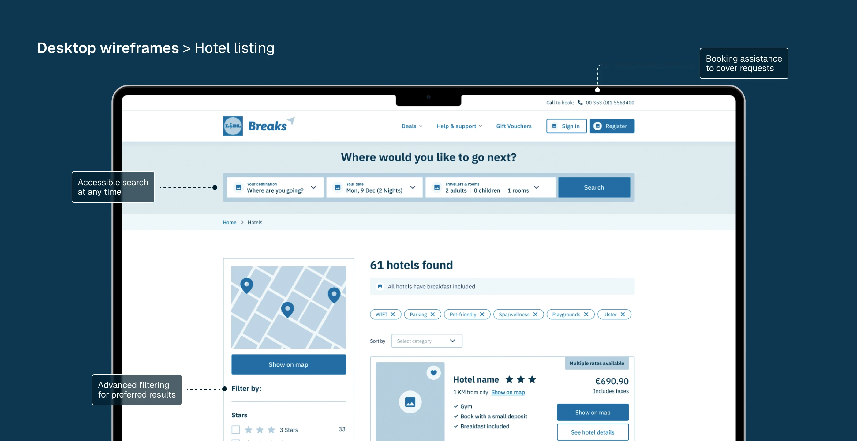
Designing the booking experience
The next steps in the design process for Lidl Breaks built on insights from the discovery phase. We developed concepts to address user pain points, created wireframes and prototypes for each persona, tested usability, applied visual design and branding, and conducted pre-launch validation to ensure a smooth, trustworthy booking experience.
Key steps in the design process:
- Ideation: Translating user pain points and goals into solutions
- Wireframing: Defining layouts and information architecture
- Prototyping: Building interactive flows for each persona
- Visual Design: Applying branding, imagery, and trust cues
- Validation: Testing final designs and refining before development handoff


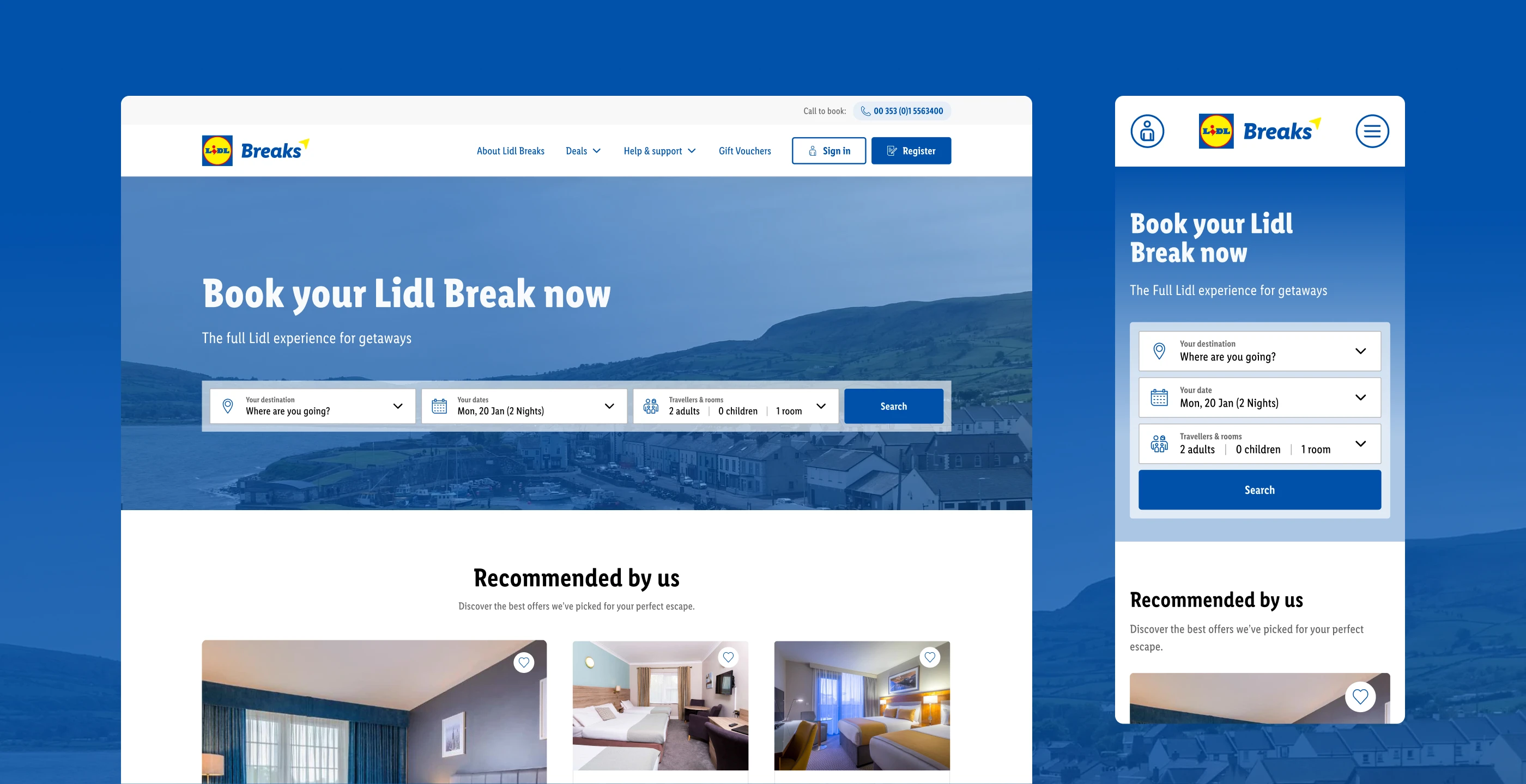
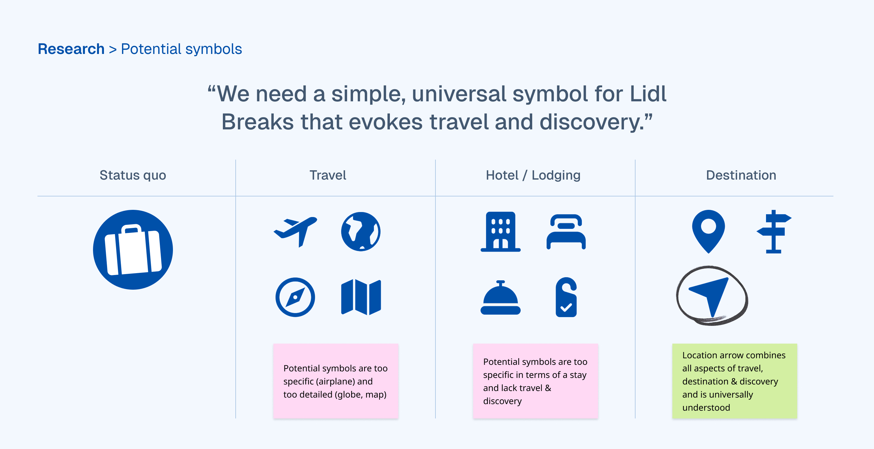
Strengthening Lidl Breaks’ visual identity
The original Lidl Breaks logo presented several challenges: inconsistent spacing, an unapproachable uppercase wordmark, and a generic suitcase symbol that didn’t reflect the brand’s broader travel offering. With the Lidl team, we identified the need for a refresh aligned with the website relaunch, creating a modern, welcoming identity that builds trust in Lidl Breaks.
The redesign addresses these issues through three key improvements:
- Spacing guidelines: Adherence to main brand standards for better balance
- Typography update: Shift from uppercase to lettercase for enhanced approachability
- Symbol redesign: Replacement of suitcase icon with location arrow for universal recognition
These adjustments create a more cohesive connection to the Lidl parent brand whilst strengthening the travel service's distinctive identity.


Impact
The Lidl Breaks redesign addressed outdated visuals, poor mobile usability, and a cumbersome booking process. With a mobile-first, user-centred design, simpler navigation, and trust-building features, the platform became more modern and efficient, attracting more daily visitors, boosting page views, improving global rank, and achieving faster load times.